
Most people agree that the way you present yourself is extremely important. Whether you’re going to your first class of the year, meeting someone for the first time, or just running errands, the way that your present yourself says a lot about who you are.
You can say the same thing for the way you present your blog or web page. If you’re unorganized and messy, people will take notice and most likely stay away. If your web page is cluttered with content and seems to have no order to it, visitors will most likely deem it unprofessional and will chose to get their information from another site.
In Chapter 3 of his book Writing for Digital Media, Brian Carroll suggests that one way to make a web page as presentable as possible is to make it as simple as possible. This is not to say that a website’s author should eliminate all types of graphics and strip it down to black and white text. What this means is that every website should have its own way of organizing its content into a clear and concise format that is not disrupted by flashing buttons or moving banners. A second important quality that web pages should have if they intend to be successful is to use repetition throughout the site. Not only does this create a sense of fluidity, it also creates a sort of brand for that site.
As Carroll points out, one of the most important qualities that a successful web page can have is a well organized navigation system. One way to do this is by using the inverted pyramid method. By having the broadest information at the top of the page and the most specific information at the bottom of the page, readers are able to quickly scan the web page as soon as it appears on the browser for the information that they are searching for.
Carroll mentions earlier in the chapter that people reading information from websites often read up to 25% slower than people getting that same information from a printed source. This means that in general, people on the web are looking for the easiest accessible information due to the fact that it takes much longer to go through the information and to find what they are looking for. In some cases, the format of the entire site is even set up in this way with the name if the site in the header, the category in which the information is arranged in the sub header and finally the article below that. Here are a few sites that I think do a great job of giving the basic information first, with the detail farther down the page:

With the constant subheading of categories always available for the viewer to use to navigate through the site, CNN makes it easy for readers to quickly switch from one topic to the next without having to backtrack to the home page.
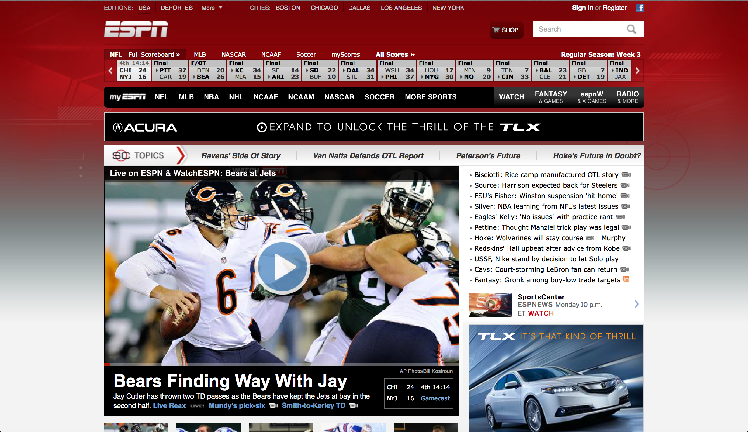
While ESPN definitely has a busy-looking website, all the information that you could need (i.e. all of the sports as well as hottest topics) are displayed at the top of the page right below the ESPN logo and are kept there on just about every page as you move from article to article.
I think that the use of repetition throughout a site is possibly more important that the actual structure of a page. Due to Google and other search engines like it, we can enter a website on just about any page. This means that the first page we see in most cases will not be the “home” page. For this reason, I think that it is extremely important that there are consistencies throughout an entire website so that each visiter knows where they are while they are searching for something. The websites that I posted above are all great examples of sites that use repetition through out the entire site. Here are a few more that have more to do with the marketing side of things and have successfully demonstrated their brand though out their site:

Nordstrom does a great job of using the same layout on every page. This makes it easier for the shopper to navigate the large site with multiple departments to shop through, and thus makes it a more enjoyable experience as well.
One of the neatest things about websites that are dedicated to shopping is that many of them track where you have been on the site as you’ve searched so that you can easily navigate your way backwards.

No matter what page you go to on Ford’s website, there is always the iconic “Ford” logo in the top left corner. This, along with the same color scheme and same font styles thought the post create repetition and thus fluidity.
So just like if you’re planning on meeting someone for the first time and you would want to present yourself as organized and put together, make sure your readers get that feeling when they’re visiting your website or blog. The last thing you want is for someone to turn around before they find the information they are looking for just because everything looks messy.
